Industry
Legal
Agency
Rebel Interactive
ct designlab
Role
Lead UX/UI Designer
Lead Designer
Carmody

Carmody | Torrance | Sandak | Hennessey LLP is one of Connecticut's leading law firms with a focus on excellence and cost-effective legal services. Carmody is a mid-size law firm with offices in five locations throughout Connecticut.
REBEL INTERACTIVE AGENCY PROJECTS
Website + Mood Board
The Ask
I led the UX/UI design for the redesign of Carmodylaw.com, an 80+ page, content-rich website providing detailed information about the firm. In addition, I developed a mood board to guide the site's updated visual direction.
The mood board established the style for typography, photography, and the color palette. The client felt the previous Carmody site was too bold, with excessive orange from the logo, and didn’t reflect the firm accurately. They hired Rebel to create a more sophisticated, polished design, both visually and technically.
Given the site's size and complexity, careful planning was essential. I created high-fidelity wireframes to streamline the UI design process and annotated designs with a style sheet for developers. After development, I played a key role in the QA process through to launch. This project was a significant effort, taking six months to finalize, build, QA, and launch.
Process

Mood Board
Website Design
Result
The result of this project was a more refined and sophisticated website that accurately represented the firm’s brand and professionalism. The mood board set a clear direction for the typography, photography, and color palette, ensuring a cohesive and polished aesthetic. The high-fidelity wireframes and detailed style sheet streamlined the design-to-development handoff, making the process efficient despite the site’s complexity. After six months of development, QA, and refinement, the new Carmody site successfully launched, providing a visually engaging, user-friendly experience that aligned with the firm's vision and improved its online presence.
CT DESIGNLAB PROJECTS
Brand Guide + Brochure
The Ask
The Brand Guide details the work done on the mood board and website, ensuring consistency in the firm’s identity. A new brochure was also created to provide key information about the firm, designed for prospective clients.
Process
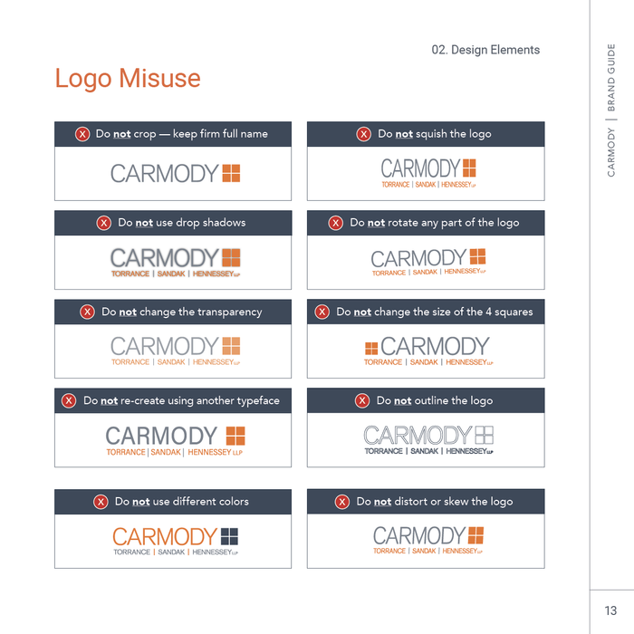
I designed the Brand Guide and brochure in a square format to reflect the logomark, creating a cohesive visual identity. Having established a strong foundation with the mood board, the designs were both exciting and efficient to execute. The Brand Guide included typography, color palettes, logo usage, and imagery guidelines, ensuring consistency across all materials.
Carmody Brand Guide
The Result
The result of designing the Brand Guide and brochure was a cohesive and professional visual identity for the firm. The Brand Guide provided clear guidelines for typography, color usage, and logo application, ensuring consistency across all platforms. The brochure effectively communicated key information to prospective clients, reinforcing the firm's brand while delivering a polished, engaging presentation. Both materials helped establish a strong, unified presence that reflected the firm's values and expertise.


